LookSmart Logo Update
2003
 In 2003 the LookSmart logo was in need of an update,
as it wasn't as flexible enough for various branding and marketing needs.
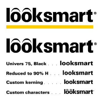
I created two new versions of the logo. The first version reduced the size of the yellow bar, as the original bar overpowered the wordmark and didn't scale well. The second one allowed for the complete removal of the yellow bar. I also thickened the eyebrows to match the wordmark's font weight.
I then developed a Style Guide to illustrate the proper usage of the LookSmart logos.
Tools: Photoshop, Illustrator